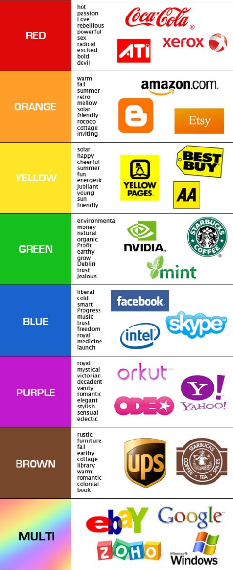
Facebook is blue-> According to The New Yorker, it’s because Mark Zuckerberg is red-green colorblind. This means that blue is the color Mark can see the best. In his own words Zuck says:
“Blue is the richest color for me I can see all of blue.”
Not exactly scientific lol. There are fantastic examples of how colors actually affect our purchasing decisions.
Most of us are Visually stimulated, we get appealed to things based on how they look. It makes sense that 90% of our judgement for buying a product is made by color.
So how do colors really affect us and what is the science of colors in marketing really? Do builders of web pages really need to worry about the perfect website colors? Let’s explore some of the latest, most intriguing research on it.
First-> Can you identify the brands below based on color?
First, let’s test your recall that shows you how powerful color alone really is. Based on just the colors below, can you guess which company belongs to each of them:
With the first photo, we can easily recognize the brand is NIKE without the Nike name, right. Exactly, and if we were to eliminate the letters NBC, above their logo we would still recognize the brand from the colors alone.
The Feelings That Colors Trigger in US?
Lets begin the journey to being conscious about what color triggers us to think/feel in a certain way. The Logo Company has determined specific colors are best for specific types of businesses and why. Here are four examples:
The Color Black:
Qualities-> definite, credible, strength, powerful, precise, professional, direct, accuracy.
Best Used For -> corporate, construction, oil, finance, fashion, manufacturing, Cosmetics, mining, marketing, tradesman.
THE COLOR GREEN:
Qualities –> natural, Organic, Youth, Nurturing, Instructional, Education, adventurous, ecological, calming, nature.
Best Used For –> medicine, government, science, recruitment, ecological-business, tourism, human resources.
THE COLOR BLUE:
Qualities –> credibility, calming, clean, focused, medical, professional, judicial, power, business like.
Best Used For –> medical, scientific, utilities, government, healthcare, high-tech, recruitment, tradesmen, legal, information technology, dental, corporate.
NOW when we LOOK at major brand LOGOS, WE know their secret as to why they selected that color! Shhhhh (lol) Their color choices make more sense now, don’t they. Companies are seeking to trigger a very specific emotion:
When we want to buy something, the colors can play a major role. Analytics company KISSmetrics created an fabulous infographic on the science of how colors affect our buying.
Especially the color, “Green” because it is the most relaxing color we can use to make buying easier. The color black is used frequently for luxury products.
How To Improve Your Marketing With Better Use of Colors:
Here are some cool tips we can apply today to our website or app! Based on the research from KISSmetrics.
If you are building or have an app or website that mainly targets Women, here is KISSmetrics suggestions for you:
- Women love: Blue, Purple and Green
- Women hate: Orange, Brown and Gray
In case your app or website is strictly targeting men, then suggested colors are different:
- Men love: Blue, Green and Black
- Men hate: Brown, Orange and Purple
A EXCITING experiment, conducted by Performable (now HubSpot) wanted to discover if changing the color of the buying button, would make a difference in conversion rates.
They started out with choosing between two colors (green and red).
For green, they thought:
“Green connotes ideas like “natural” and “environment,” and given its wide use in traffic lights, suggests the idea of “Go” or forward movement.”
For red, they thought:
“The color red, on the other hand, is often thought to communicate excitement, passion, blood, and warning. It is also used as the color for stopping at traffic lights. Red is also known to be eye-catching.”
TRY GUESSING WHICH COLORED BUTTON HAD THE HIGHEST CONVERSIONS (people who bought more)?!?!
A A/B test between green and red would result in green, they thought. Were they right???
The answer is (DRUMROLL)…………………………………………….
The RED button outperformed the green button by 21%
It is very important to keep in mind that nothing was changed but the color:
21% more people clicked on the red button than on the green button. Everything else on the pages was the same, so it was only the button color that made this difference.
I am not surprised at all. Red to me has always represented a powerful color, after all it is the a color we use to represent fire.
Will you be changing the colors of your web sites now, graphics etc….?? Let me know, love to hear your thoughts below 🙂


